primary
Logo · dark grounds
Blush letters and one pink cell. For void and other dark grounds.
> o1tean.com/brand
o1tean is one person: a graphic designer and an IT developer. The logo is the name with one character switched, oltean with its l turned into a 1. Below: the logo, colours, type and motion, every file ready to copy or download.
Use the full logo by default. The mark (the o and its cell) is for square or tiny slots where the name is already known. Keep the clear space. Never redraw, recolour or retype it.
primary
Blush letters and one pink cell. For void and other dark grounds.

light
One colour, void. Pink is too faint on paper (2.33:1), so the light logo carries no pink.
mark
Avatars, app icons and square slots. Minimum 40 px; at 32 px and below, use the favicon.

mark
The same mark in void, with the 1 knocked out of the cell.
One colour: white SVG for photos and third-party dark grounds, black SVG for print, stamps and stickers.
o1tean is oltean with one character switched. The switched character sits on a pink split-flap cell, the developer's character cell, beside the o, the designer's circle. In the logo, l and 1 share one stem and one foot and differ only by the flag, so one flap of the top card turns oltean into o1tean.
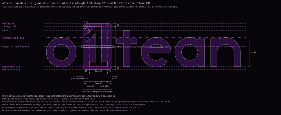
construction · units of 1/100 x-height
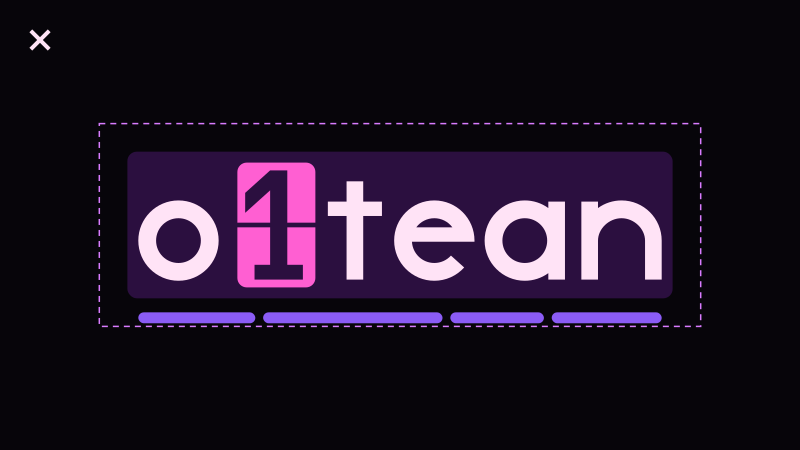
X is half the x-height. Keep X clear on every side; it is already inside every file, so place them as they are and never crop.
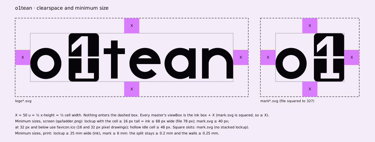
minimum sizes
Favicon: link only the ICO, which holds the 16 and 32 px drawings.
Each misuse below is rendered from the real logo. The fix is underneath.
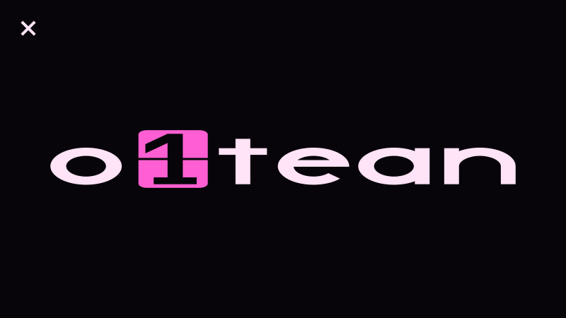
DON'T
Scale proportionally. If it doesn't fit, use the mark or change the slot.
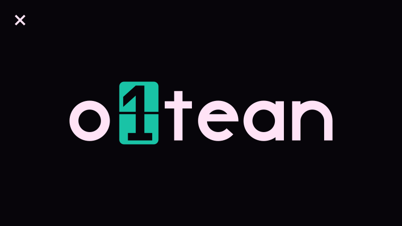
DON'T
The cell is pink on dark grounds and void in the light logo. No other colours.
DON'T
Pink marks only the one switched character. Letters are blush on dark.
DON'T
Alone it reads as a badge or a keycap. Always pair it with its o.
DON'T
Flat fills only. Glass and glow belong to the site, never to the logo.
DON'T
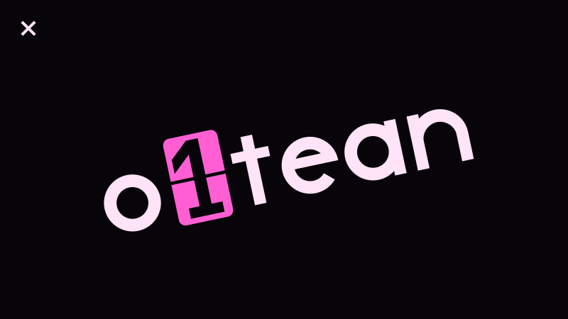
The l lives only in motion. Every static use rests on the 1.
DON'T
Keep it upright on its baseline. Only the flap moves the cell, and only in motion.
DON'T
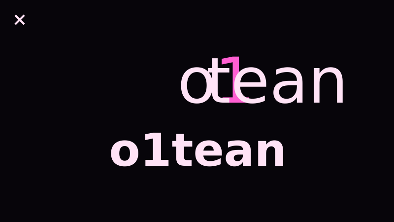
Use the drawn logo files. HACKED and Hack set the words around it.
DON'T
Keep X (half the x-height) clear on every side.
DON'T
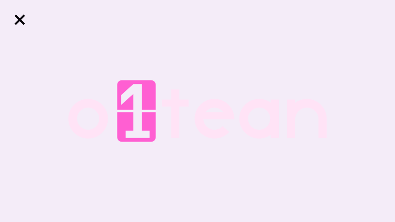
Blush on paper is 1.04:1. Use the light logo (17.6:1).
Void leads. In the logo, pink is only the cell; in an interface it stays rare, one pink element per view. Orchid carries the liquid; violet and plum carry depth. CMYK values are ICC conversions (GRACoL 2006); proof before print.
canvas · 60%
17.6:1 with paper
letters on dark
17.0:1 on void
the cell · one per view
7.55:1 on void · 2.33:1 on paper
the liquid · links, progress
8.0:1 on void
secondary · idle
4.8:1 on void
depth · decorative
1.2:1 on void · never for text
light canvas
void on paper 17.6:1
files
Every colour, radius and motion value as CSS custom properties, plus the colour worksheet with HSB, HSL and Lab.
A typical layout is mostly void, with plum for depth, orchid for the liquid and a single pink accent.
DON'T
One switched character, one pink. Use orchid or blush for everything else.
DON'T
They are 1.06:1 apart. Set them side by side, never one on the other.
DON'T
Void is the canvas. Accents mark one thing at a time.
DON'T
Both fall under 3:1. On light grounds, text and logo go void.
DON'T
Gradients and glow are light in the site's glass and motion, never fills on the logo.
DON'T
Use void and paper for large areas. Keep #000 and #fff for one-colour print files.
The logo is drawn, never typed. HACKED speaks in headlines; Hack does everything else.
display typeface
Headlines and section titles, 32 px and up, one weight. Never for body text, never for the logo.
display / 400
I design in pixels
section title / 400
two sides
text, ui and code
Reading text, labels, metrics and code. Regular 400 and Bold 700.
bold 700 / labels and metrics
LABEL · TOKEN · 0123456789
regular 400 / reading text
I design in pixels and build in characters.
regular 400 / code
--o1-pink: #ff5fd2;
The logo moves the way it was named: one character changes. One flap, a click, a long hold. Everything else enters quietly, and the liquid is the only thing that flows.

intro · 5.2 s, plays once
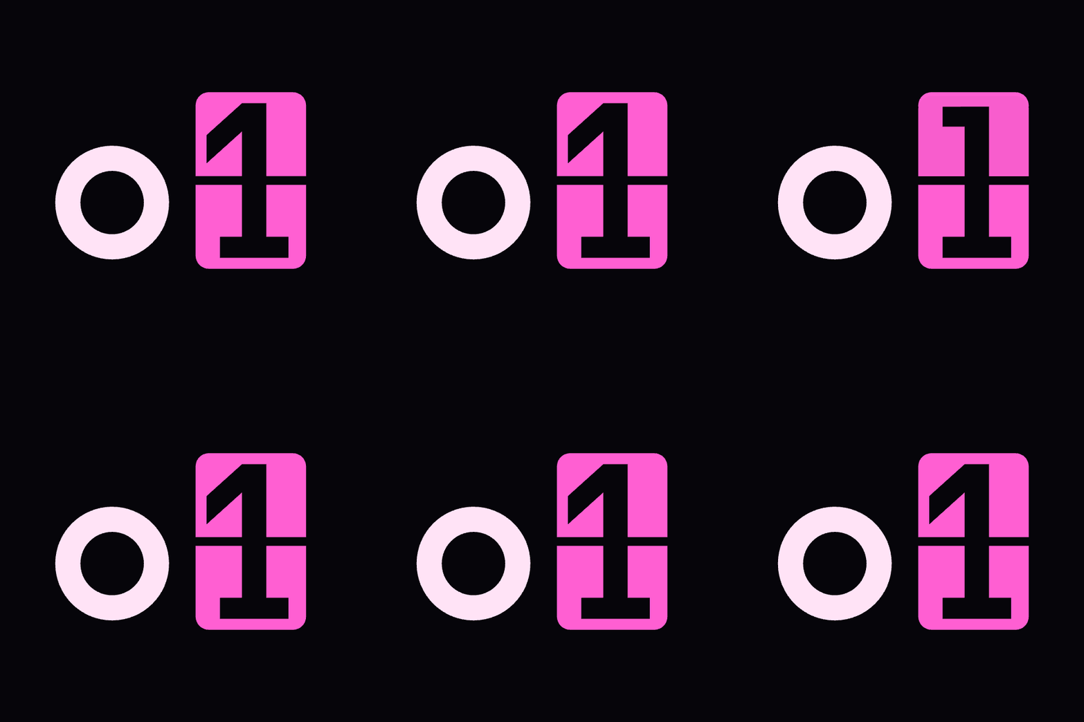
The o pops, the cell opens on an l, the liquid rule lifts t-e-a-n and drains, then one flap turns the l into a 1.
idle · loop
The mark rests on the 1. The cell ticks to the l and back; the l is never on screen for more than 0.4 s.
loading · links
The rule wells out of the cell's foot, spreads both ways and drains back. The same curve fills link underlines and progress bars.
| token | value | use |
|---|---|---|
--o1-ease-enter | entrances: the cell opening, panels arriving | |
--o1-ease-pop | the o and t-e-a-n popping in: one 3% overshoot | |
--o1-ease-spread | the liquid spreading: underlines, progress | |
--o1-ease-retract | the liquid drawing back | |
--o1-ease-fall | the flap falling (gravity) as a rotateX angle | |
--o1-dur-flap-hero | the intro's one flap | |
--o1-dur-flap | one card in loops and loaders | |
--o1-dur-click | the click after a flap lands: light only, nothing moves | |
--o1-dur-pop | one pop: the o, each letter | |
--o1-dur-read | "oltean" holds before the flap | |
--o1-dur-hover | nav logo hover: 1 → l → 1 | |
--o1-dur-spread | link underline fill |
<img>, serve the end-frame PNG instead.<video> with no poster for the intro (a poster would give away the ending; the void box is frame 0), the inline nav logo with nav-logo.css for hover (try the logo in the bar above), and the animated SVG where scripts can't run, like READMEs.Icons, social images and UI pieces built from the logo's own geometry.
400 px, circle-safe.

Pixel-drawn at 16 and 32 px, on its own void tile so it shows on light and dark tabs.
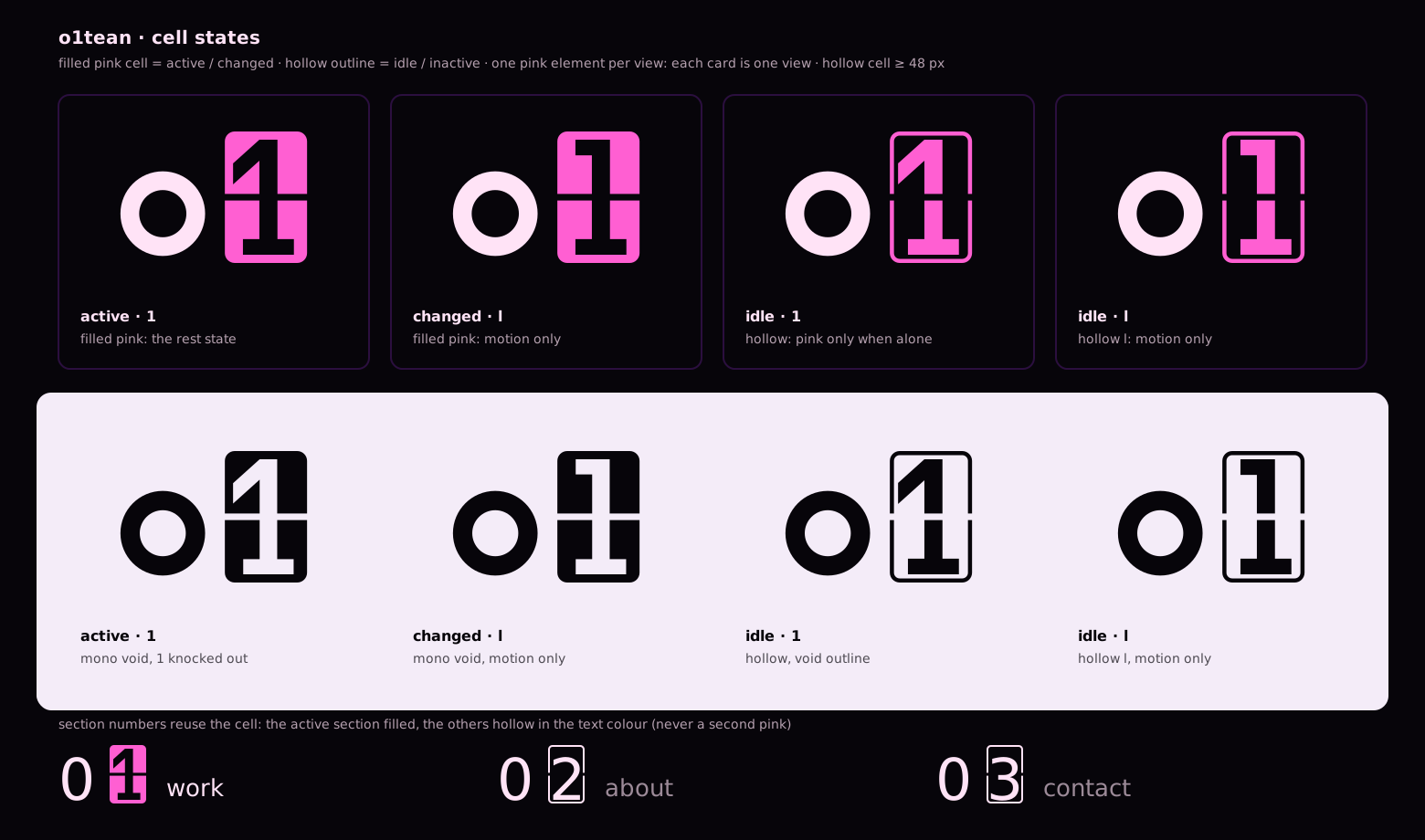
A filled cell means active or changed; a hollow cell means idle.
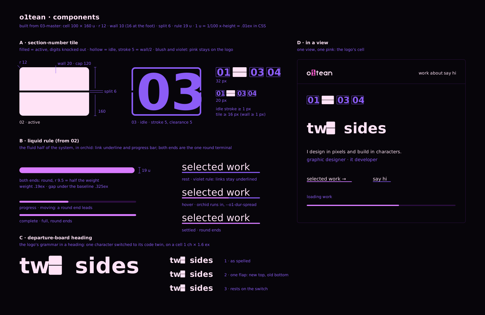
Section-number cells, the liquid underline and the progress rule.
Ten directions were built, animated, critiqued and scored before this one was chosen. They are kept, not deleted.
01
02
03
04
05
06
07

08
09
10 · chosen